Responsive image markup

TL;DR - resize this page (or rotate your phone screen) to see different images load magically.
Doing responsive images right is complicated, largely given the number of different scenarios to consider:
- delivering the best file format for the browser and reader’s net connection
- delivering the optimal resolution image (pixel density) given the DPI of the user’s device
- picking the best particular crop of the image for user’s device + window size / orientation (art direction)
- fitting the chosen image appropriately into the page layout, given things like column width, whitespace, etc.
The HTML WhatWG has considered all these factors, and
accommodates them in modern HTML using new tags like <picture> and new
attributes like @srcset and @sizes, which in turn use a strange new
list format rarely seen in HTML.
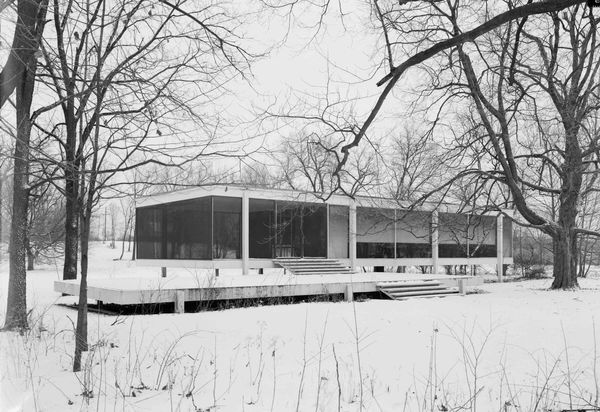
To make all this work together to deliver a responsive image like the one below, this site (TIL) employs:
- a Hugo shortcode template that emits
- HTML
<picture>and<source>element tags - with the new
@srcset+@media+@sizesattributes
- HTML
- a fallback
<img>element for old browsers - some lightly modified CSS
- with new image variations batch-processed with
gulp-responsive - a Javascript lazy-loader to only load the currently in-window (viewport) images #overkillforthisblog
A single image on a page, displayed with an awareness of browser width, screen density, and scroll position now involves five different levels of the front-end layer cake.